
Overview
This was my first project in the world of UX as a student of CareerFoundry’s UX Design Introduction course. We were assigned to create a vocabulary application for mobile usage.
As a lover of continuous education, I thought it would be intriguing to create an application suitable for adults. Therefore, I designed an application that presented vocabulary words within an excerpt for users to learn through context clues.
 Roles and Responsibilities
I was responsible for the project in its entirety from conception to research and prototyping. Here a brief summary of my process:
- competitive analysis
- user interviews
- proto-persona
- problem statement & hypothesis
- user flows
- low-fidelity wireframes
- low-fidelity prototype (not shown)
- mid-fidelity wireframes
- insights & future directions
 Competitive Analysis
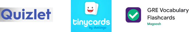
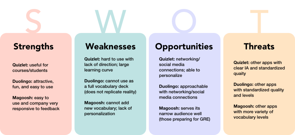
I conducted a competitive analysis of three different vocabulary mobile applications to better understand the current applications available and to strategize how my application would stand out among the existing applications. I investigated Quizlet, Tinycards by Duolingo, and GRE Vocabulary Flashcards by Magoosh.
I synthesized my research into the below SWOT analysis for the three applications.
 Insights: Competitive Analysis
There was a general lack of standardization of vocabulary sets in the mobile applications.
The description of decks were not clear; for example, a deck would state ‘beginning level’ but this was not clear as to what type of beginner and the age group suitable for the deck.
The part of speech was not always available for the new word. This would be important for users on how to use the new term.
 User Interviews
After investigating different applications, it was important to also research how people learn vocabulary through user interviews. I conducted three user interviews on those who are continuously learning new vocabulary. I focused on asking about the methods used and the challenges met when learning. Below is an example of one of my user interviews.

Insights: User Interviews
In general, users needed context when learning new vocabulary. They learned
vocabulary best when the word was used in different forms activating different senses
(example: visual cues, listening, watching, etc).
The user interviews confirmed the usefulness of an application focused on using
context clues to teach vocabulary.
 Proto-Persona
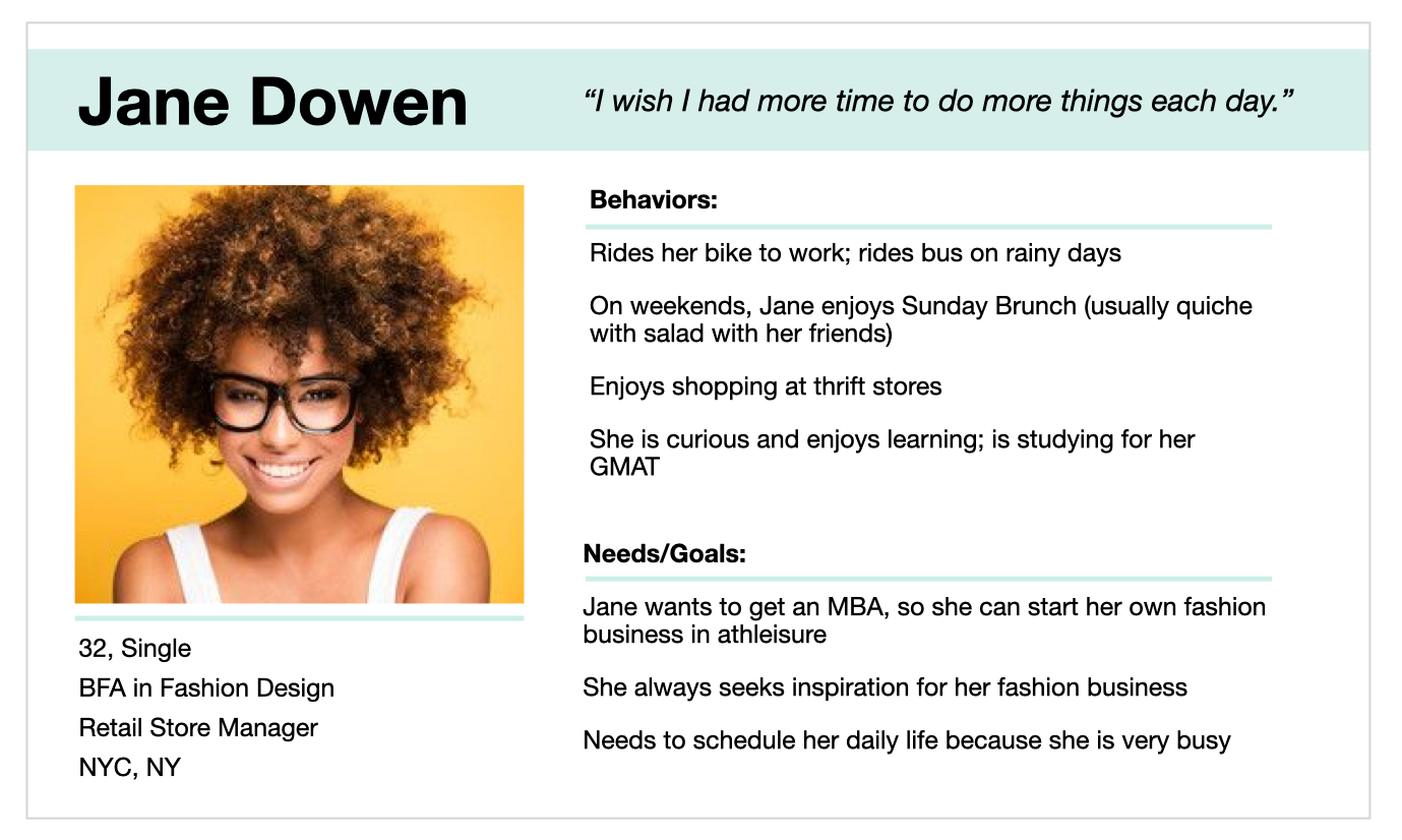
With the data collected from initial research, I was able to create a proto-persona to focus the creation of the vocabulary mobile application on its intended audience.
 Problem Statement & Hypothesis
Problem Statement
Jane needs a way to schedule in daily studying that can inspire so she can prepare for the GMAT while forming ideas for her athleisure business.
Hypothesis
A vocabulary mobile app using written excerpts to inspire and teach new words will help Jane save time to study while exploring new ideas.
 User Flow
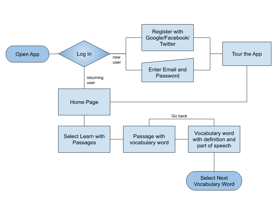
To begin planning the application, I created user flows to show how specific application features would be accessed. Shown below is a user flow of how a user would view one complete vocab flashcard.
 Wireframing
Wireframes were sketched from the user flows, and a low-fidelity prototype (not shown) was developed for usability testing.

 Usability Testing
I performed in-person and remote moderated usability testing with the low-fidelity prototype. The goal of the testing was to determine the learnability and the efficiency of the application’s main features such as onboarding, viewing a vocabulary word, adding a vocabulary word, and adding additional sources for excerpts.
Usability Testing Results
Nielsen’s Error Severity Rating Scale was used to analyze the usability testing results, whereas 4 indicated an extremely severe error that needed to be prioritized and fixed. The table below shows the tasks that users were asked to perform during the testing, the observations with Nielsen’s Error Severity Ratings, and the recommended methods to improve the application.
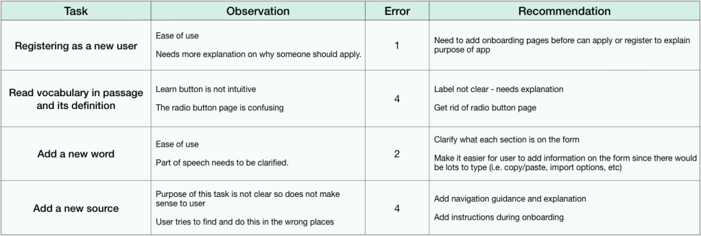
Insights: Usability Testing
The initial prototype had no clear explanation of the purpose and how to use the application. Therefore, users oftentimes just quickly tapped the screen randomly with confused expressions. This was a significant oversight on my part, so I expanded and added an onboarding section for the next step. Although applications do have information before downloading on Apple store/Google play/etc, it is cleaner and clearer for a user if the information is also included inside the application.
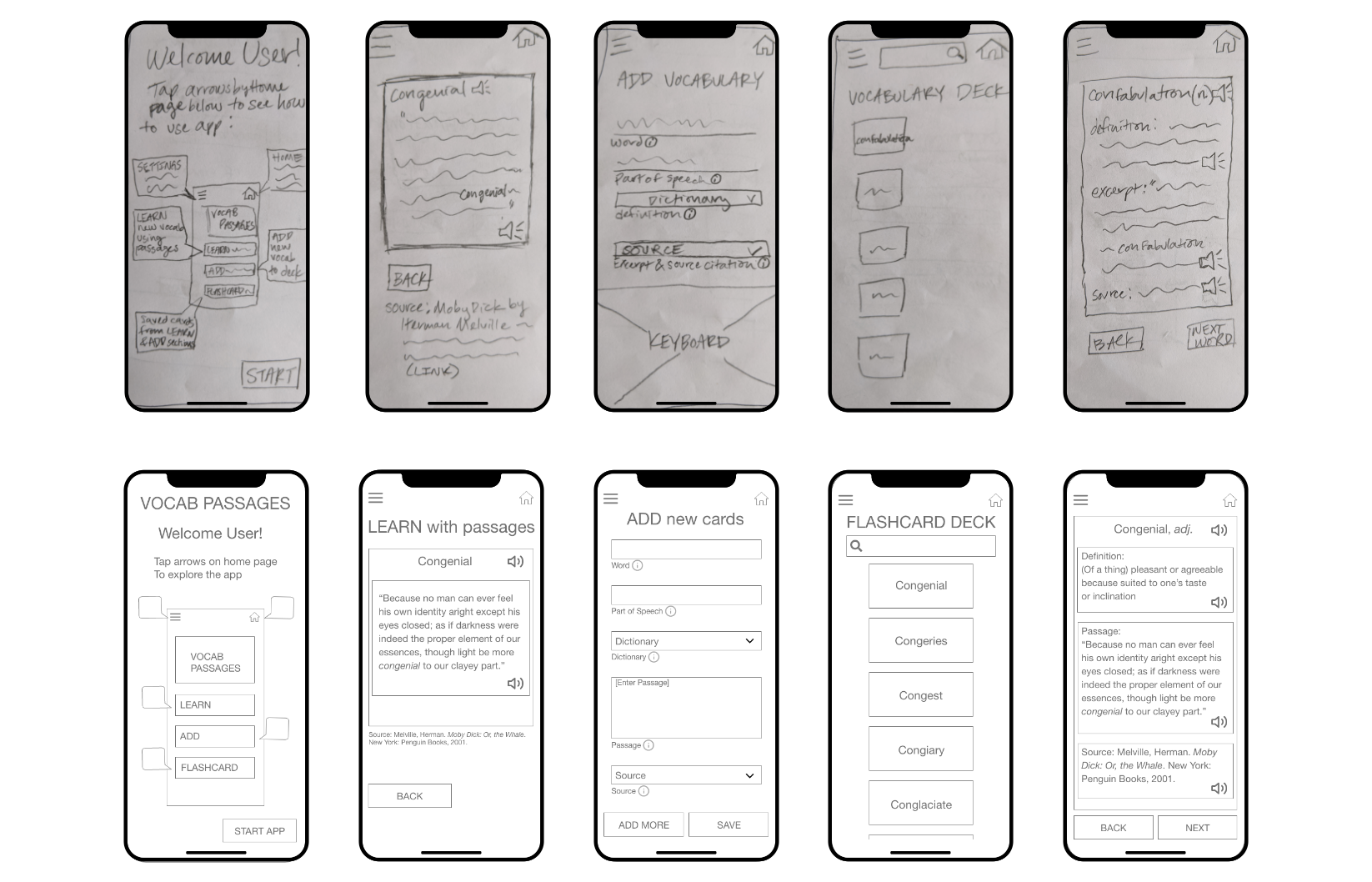
Wireframes Revisited
The low-fidelity wireframe issues were fixed as low-fidelity wireframes and then transformed to mid-fidelity wireframes. They are shown below.
Insights & Future Directions
The next steps would be to perform another round of usability testing before creating a high-fidelity prototype for this application. Depending on time and resources, reiteration of testing and building would create a better user experience.
The application could be more accessible if it were able to be played like a podcast. Since the vocabulary words are attached to passages, I think it could be a unique feature for the application. This is an additional direction I would be interested in exploring for this project.
As my first project in UX, I learned much about the overall process of creating an application based on users. I enjoyed the learning and building process and was always fascinated by how differently users think and behave.
If you have additional questions about this project, feel free to reach out to me at Marcia.Hsu.UX (at) gmail (dot) com.
Thank you for reading!

